RGB color models are very useful. A computer monitor typically has a large array of tiny red, green, and blue colored cells, these cells being so small that we cannot see them without a magnifying glass. The cells blend together to give us the other colors. For example, if the red and green cells are turned on, and blue is turned off, we are likely to get a shade of yellow. This physical process of mixing colors of light is very similar to how colors are defined in the various RGB color models: the primary red color in sRGB is defined as the three color numbers [255, 0, 0] and the computer monitor will likewise fully turn on the red cells while keeping the green and blue cells off. A particular medium gray color, defined in sRGB as [186,186,186] will cause the computer monitor to set the red, green, and blue cells to an intermediate value about halfway between fully on and fully off. Now, while no computer monitor or other digital imaging device has precisely the same properties of the sRGB standard, these are usually designed to be close enough for most purposes.
But there are some problems. First, you cannot mix red, green, and blue paint together to do decent painting, for we aren't mixing pure light, like on a computer screen, but rather are mixing together pigments which absorb some of the light falling on them, reflecting away the rest. And so, the RGB color system isn't particularly useful for painters, and is likely highly misleading: see the article Additive versus Subtractive Color. Furthermore, you cannot get all shades of colors by mixing together only three colors of lights.
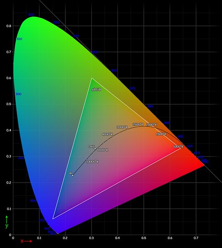
The image below, called a CIE chromaticity diagram, shows the range of saturated colors that can be seen by the human eye:
[source]
The curved outline shows the full gamut of human vision, while the triangle within it shows the gamut of the sRGB color standard. If you use three primary colors for your standard, your available colors will be limited to only those colors within the triangle. sRGB excludes pure spectral violet, and deep scarlet red, and also neglects bright cyans and greens. Please note that this image itself is fully within the sRGB color standard, and so we cannot show you here the full range of visible colors, only the relative amount of color that can be represented by sRGB.
Wider gamut
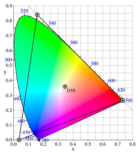
You can get a larger percentage of all colors if you use color primaries that are farther apart. The Adobe, ProPhoto, and Wide Gamut RGB standards all have three primary colors that are farther apart than sRGB, and so can represent more colors. On some of these systems, they don't even use real colors as primaries — the primary blue and green “colors” in ProPhoto are impossible colors, and are located outside of this gamut curve.
[source]
There are two problems with using wide-gamut color systems: first, if you use only 8 binary numerical digits for each color, as is typical with sRGB devices, that is, if you use a range from 0-255 without fractions, you are likely to see banding when viewing photographs on a display. For this reason, most authorities recommend using 16 bits when editing an image in a wide gamut. The second problem is that none of these wide color gamut RGB systems can display the entire range of human color vision.
As an exercise, you can draw a triangle that will encompass the entire human color gamut. It would be quite large, and the green and blue primary “colors” will be outside of the gamut of visible color. It would be impossible to construct a computer monitor that would display these colors while using only three real primary colors. Alternatively, you can use more than three primary colors, and this is exactly what painters, watercolorists, and digital printers do.
CIELAB
The CIELAB color system, also known as L*a*b*, or in Photoshop as the Lab color system, can represent all the colors visible by the human eye, and it does so by using three numbers, like sRGB. However, to get the full range of human color vision, it abandons the idea of using three primary colors.
The CIELAB color model is not defined by engineering considerations, as is found in sRGB, but rather is based on actual human color vision and how it works. It was designed by laboratory experiment under controlled conditions, with human subjects, and it attempts to be visually uniform.
As mentioned, CIELAB uses three numbers to determine each color, with each number acting as a distance along an axis, forming a three-dimensional solid of visible color. Choosing a frame of reference can be arbitrary, but it is greatly helpful if our system of measurement conforms to reality in a strong way. In mechanics, principal axes of a three-dimensional solid are those axes of rotation where the solid rotates easily without wobbling. And so, the north and south poles of the earth form the main principal axis of the world, and geographic latitude is measured from those poles. Likewise, CIELAB attempts to find the principal axes of human color vision, making it more natural and consonant with how we actually see.
CIELAB attempts to produce a uniform model of human color vision, and so a three-dimensional color solid based on CIELAB ought to have principal rotational axes as defined by the standard. The principal axes used by CIELAB include L* (called Lightness in Photoshop), which has only brightness without color, and two color axes a* and b* (called a and b in Photoshop). Having a pure lightness axis is quite natural, and so we find that black and white photography produces easily recognizable images.
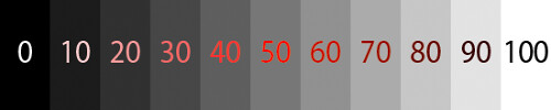
CIELAB’s L* axis is grayscale, with 0 being black, and 100 being white. [Specular highlights in CIELAB can be greater than 100, but Photoshop does not support this. L=100 in Photoshop is the maximum intensity white.] L* was designed to be visually uniform, so that, say, going from 10 to 20 units L* appears to be the same amount of illumination increase as going from 40 to 50. If you actually measure the illumination, you will find that the eye responds non-linearly to the amount of light, and so our vision compresses highlights while expanding shadows. Examine the image above: you should be able to clearly distinguish each step shown from each other, and the steps ought to look uniform — if not, then your monitor needs to be adjusted.
Color in CIELAB
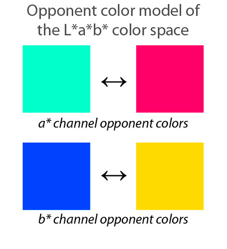
The two color axes, a* and b*, are quite unusual, and are based on the principal of opponent colors. Whereas we can say that a color is greenish blue or yellowish green, we never find colors that are yellowish blue or greenish red. We say that blue and yellow are opponent colors, and if we mix blue light and yellow light, we don’t get a third color, but rather we get white light. In the sRGB color wheel below, colors that are opposite from each other on the wheel are opponent to each other; if you mix them together equally you get a shade of gray:
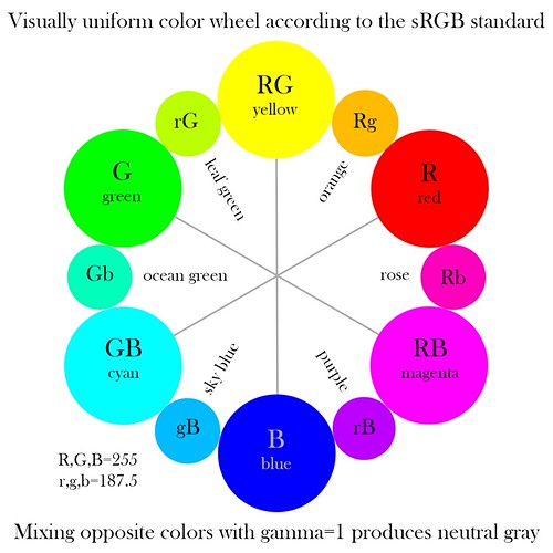
No two colors are quite as much unlike each other as are blue and yellow, they are opponents and differ greatly in brightness. No fully saturated color is as dark as blue, while none is brighter than yellow, and so this difference of color is found in CIELAB’s b* axis. [Please note that while my illustration above is called a “visually uniform” color wheel, this is not quite true, since only the tertiary colors such as orange, rose, or sky blue are uniformly placed between the primary and secondary colors of sRGB. The placement of colors around the wheel falsely assume that the primary colors are uniformly visually different from each other — rather, these colors were chosen by engineering considerations, and not by careful study of human vision.] Likewise, halfway between the axis of blue and yellow we find green and magenta, also opponent colors, and this makes up the a* axis.
Remember that sRGB is a somewhat arbitrary engineering model of a limited gamut of color, while CIELAB attempts to model all colors. We shouldn’t expect the CIELAB axes to correspond directly with sRGB colors. Here are the CIELAB color opponent axes:
We have ocean green opposed to rose along the a* axis, while a dark sky blue is opposed to a slightly orange tone of yellow along the b* axis. Don’t take the actual brightness of the colors shown here literally, for these are simply the most saturated and brightest colors of CIELAB found along the a* and b* axes that happen to be within the sRGB color gamut. Any color, dark or light, can have the same a* and b* numbers, as long as they have the same hue and saturation. The colors shown here are not primary colors in the RGB sense.
Now note that the opponent b* axis has a similar color relationship as between sunlight and the color of the sky. I don’t think this is a coincidence. A scene which shows a variation in the color of light between orangish-yellow and sky blue often looks natural, while having magenta and greenish light variation (as found in fluorescent lighting) looks sickly.
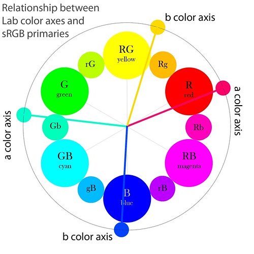
Note that the primary color axes of human color vision, as implied by the Lab model, don’t match up too well with the sRGB color standard. Particularly, the colors between red and blue are visually too far apart, while between red and yellow they are too close. An adjustment to the color wheel may make it more visually uniform and place less emphasis on an arbitrary geometrical arrangement.
You get a neutral gray color when both the a* and b* numbers are equal to zero. If a* is less than zero, it is a cool greenish color, and if a* is greater than 0 it is a warm magentaish color. Likewise, if b* is less than zero, you get a cool bluish color, and if it is greater than zero you get a warmish yellow color. The farther along an axis you go away from zero, the more saturated a color you get of the same luminous intensity. Remember, negative values are cool, positive values are warm. In the Photoshop Lab color space, both a and b run from −128 to 127, with the ends of these axes being outside of the sRGB, and likely the human color vision gamut.
Lab visualized
Here is L* plotted against a* in Photoshop:

The a* channel goes uniformly from −128 on the left to 127 on the right, while L* goes from 0 at the bottom to 100 at the top. But this is a terrible image, for most of the Lab colors shown here are actually outside of the sRGB color gamut and cannot be displayed properly. Here are the colors approximately within the sRGB gamut:
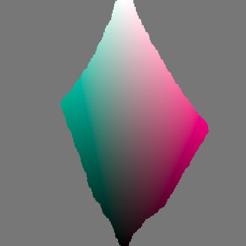
As expected, L*=100 mainly gives us white and little else, while L*=0 is mainly black. The mid tones are where most of the color action is found. Note that the boundary of the colors is irregular, and this is due to the limits of sRGB but also due to the properties of human color vision. Although barely noticeable on this chart, the vertical line between black and white is neutral gray. The CIELAB color space is very large, but the majority of the colors cannot be displayed or are impossible colors.
Here is L* plotted against b*, limited to the sRGB gamut:
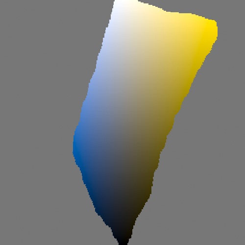
As expected, the most saturated blue is much darker than the most saturated yellow.
And here is a* plotted against b*, for various values of L*:
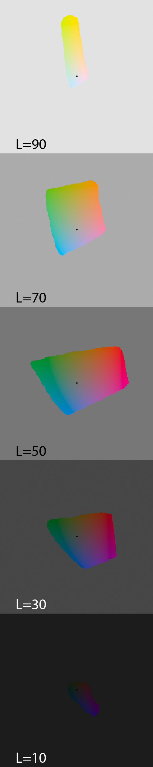
The black dot in the center of each image is the location of the neutral gray axis. Note that sRGB hardly can show any range of colors when L*=10. This deficiency can be made up when printing, by using the CMYK color space; the use of black ink by printers allows us to expand our gamut of dark tones. Many artists insist that shadows ought to show good color tonality, even if the shadow is very dark, and Lab can help you achieve this dark color before printing.
Each spot of color on each selection above ought to have the same visual brightness as its peers, but on my monitor this appears to be not be true. Is this due to a flaw in Photoshop, in my monitor calibration, or is it an inherent flaw in CIELAB itself? However, we musn’t expect perfection of CIELAB. For example, I suspect that there is a color shift when we move towards dark colors.
Lab in Photoshop
The unusual structure of the Lab color channels in Photoshop makes interpreting them somewhat less than straightforward, but it is a useful exercise to be able to visualize the color of an object simply by looking at its raw channels:
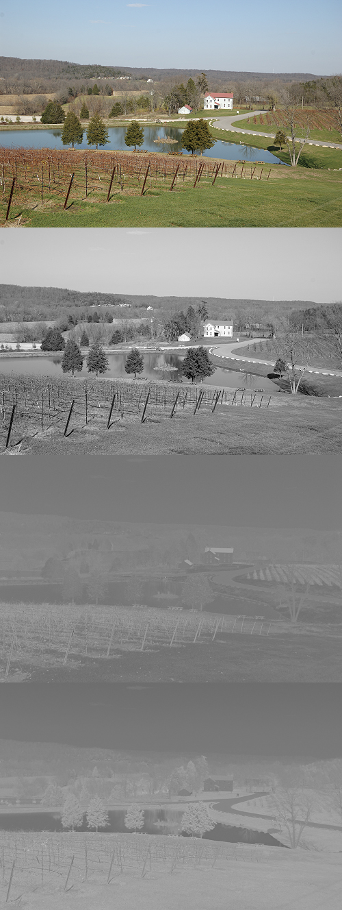
The original image is at the top, and the following L channel is quite straightforward: it typically makes for a good monochrome conversion, if some contrast is added.
The a and b channels are next, and you need to know that a middle gray is equal to no color saturation, while dark patches are cool colors and light ones are warm colors. In this photo, the house and the road are both approximately neutral, and so those items can be used as a neutral reference. By looking at the channels we can determine these:
- The lake and the sky are both dark, so we can guess that the color is cyan.
- The roof of the building is light in both channels, and so we can correctly guess that it is red.
- The grape vines are light in both channels, so they must be reddish also.
- The grass is dark in the a channel and light in b, therefore it is a yellow-green.
Using Lab
One of the most common uses of the Lab color space in Photoshop is to drive the colors apart in a way which seems rather natural. The saturation tool will easily harm colors, while applying steep curves to an RGB image will increase its saturation as well as increase the luminous contrast. Lab separates color from lightness, and so is a good place to increase chroma:
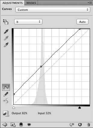
Here I used these curves on both the a and b channels in Photoshop:
Note that the curve goes through the center of the chart, with 50 input going to 50 output. This keeps the white balance the same. I moved the endpoints of the line in by 15 units on both ends, causing the colors to become more saturated.
This technique is described in-depth in the book Photoshop LAB Color: The Canyon Conundrum and Other Adventures in the Most Powerful Colorspace, by Dan Margulis. Subtle color variations often found in the rock formations of the canyons of the American west often make photography disappointing. Margulis shows how using the Lab color space to separate the colors can solve that problem nicely, and in a way that looks realistic; from there he explores the use of Lab in greater depth.

This is an extremely useful technique, and causes a uniform increase in chroma. Using an S-curve, keeping the ends and midpoint fixed while adjusting the mid-tones will selectively boost the colors near neutral gray while not pushing already strong colors too far out, as I used in this image:
The real world is wide gamut with high dynamic range, while our digital images only record a puny fraction of this reality in low contrast. Exaggerating colors a bit, as well as using other techniques such as sharpening and local contrast enhancement, can make a digital image look more real and interesting, having greater visual pop. Lab is a good space to do this kind of manipulation, for its use of color closely models how our eyes work.
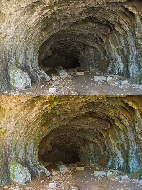
Another use for Lab is in white balance. On first examination of Lab, it would seem that this is an ideal use for Lab, but unfortunately it isn’t, for adjustments in color aren’t uniform across all levels of brightness. RAW is the best place for doing white balance, while balancing in a wide-gamut RGB color space is not far behind. This being said, sometimes Lab does a better job than other tools in Photoshop, especially in difficult cases:

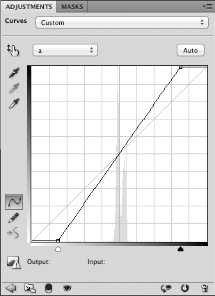
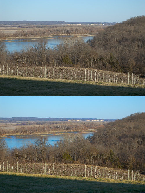
The original image on top was taken at night under orange sodium vapor lighting, and the standard RGB color balance left the image with odd greenish tones. Using Lab to white balance did a somewhat better job, although it did throw a blue cast into the shadows. Here is the Lab curve on the b channel to do this correction:
The key concept here is to adjust the a and b curves so that they remain perfectly diagonal, while bringing the white point to neutrality, where a=0 and b=0. For example, if you need to move the ‘b’ curve to the left by 10 units — shifting the image towards blue — then you move the left end of the curve up 10 units, and the right end of the line 10 units towards the right.
The nature of Lab makes it ideal for doing clever color manipulations. As this is a rather visually natural color space, you can do severe manipulations that don’t damage the image as much as in other color spaces.
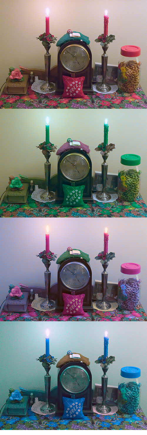
This is what I did to this image:
- The original is on top
- a channel inverted
- b channel inverted
- a and b channels swapped and inverted
Rules of thumb
Here are some rules regarding the Lab color space:
- If L is close to 100, the color is bright.
- If L is close to 0, the color is dark.
- If both a and b are zero, the color is a neutral gray, white, or black.
- Negative values for a and b are cool colors.
- Positive values for a and b are warm colors.
- Negative b and a near zero is bluish.
- Positive b and a near zero is yellowish.
- Positive a and b near zero is rosy color.
- Negative a and b near zero is a sea green color.
- Both a and b positive is reddish or orangeish.
- Both a and b negative is cyanish.
- Positive a and negative b is magenta or purplish.
- Negative a and positive b is greenish.
You may be interested in the other articles in this series:
No comments:
Post a Comment