OK, not really. This article is about color systems that ought to be useful, that ought to be implemented — somehow — in Photoshop, but they still have plenty of traps for the unwary.
Artists, unlike those who have an affinity for mathematics, may find the RGB color system a pain. They perhaps object to the idea of reducing such a subjective concept as color to mere numbers, or perhaps they object to the unintuitive process of mixing the colors together in RGB. Photoshop is such a pain. It must have been invented by nerds.
For example, the RGB color for a particular tone of orange is R=180, G=95, B=6. But this is ridiculous; orange, a mixture of red and green? And with some blue thrown in also? No, that's wrong. Orange is a mixture of red and yellow, and there ain't no blue it it at all: but for sure that dim tone of orange has some black in it. And what's with these RGB values going from 0 to 255??? That number 255 makes no sense at all. Now, if we have to use numbers (and why can't we use good names for colors instead?), then why not use something more understandable like 0% to 100%?
Also, it seems that some particularly pure colors are missing from RGB. Tyrian purple, intense electric cyan colors, and rich, deep tones are nowhere to be found.
A painter would rather describe color in ways other than RGB. Here are some artists' color terms:
Hue is the basic quality of a color: is the color basically red, orange, yellow, chartreuse, green, aqua, blue, violet, or magenta? These hues are arranged in a circle around a color wheel, which shows how these colors relate to each other, and also how new colors can be obtained by mixing other colors. Now there is some controversy as to what precise set of colors ought to be used to obtain a minimal palette: some say that the three primary colors (red, yellow, and blue) is the minimum number of colors for a basic full-color palette; although white, black, or both are sometimes added to the mix, depending on whether the artist is using paint or watercolor. Other artists say that six colors (plus black and/or white) reproduces nearly the full range of color. Since these colors can mix together to produce nearly all known colors, any extra colors in the palette are simply a convenience to the artist; they aren't strictly needed. But no matter what color system is used, mixing together adjacent colors on the color wheel will produce novel colors, while mixing opposite colors together will give a grayish, blackish, or muddy tone.
Tints are pastel colors, made by mixing a color with white.
Shades are dark colors, made by mixing a color with black.
Brightness, value, or intensity tells us how close a color is in luminous quality to either white or black, or how bright a color is compared to the brightest available version of that color. Aqua is a brighter version of teal. Azure, dark midnight blue, and Dodger blue are basically only different in brightness.
Tones are colors that are mixed with both black and white (or gray) paint. These colors are muted, toned-down versions of the base colors.
Saturation, chroma, or colorfulness is how pure a particular color is. Tones, shades, and tints are less saturated than pure hues. Slate gray is less saturated than azure. Carmine is more saturated than copper rose, even though they are approximately the same hue and brightness.
Other qualities include transparency, fluorescence, glossiness, and so forth,
A good, artistic color system will take these usages into consideration. As it so happens, there does exist the HSB (Hue, Saturation, Brightness) color system, and it is implemented (albeit poorly) in Photoshop. This color system works in a more artistic manner than RGB.
Instead of three numbers for the red, green, and blue channels, HSB provides alternative numbering:
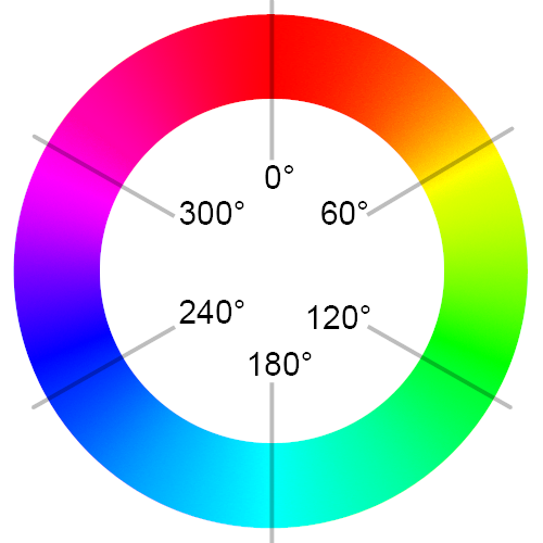
Hue specifies the kind of color, and it follows the arrangement of colors in a color circle. The assignment of colors is thus:
Red = 0°
Yellow = 60°
Green = 120°
Cyan = 180°
Blue = 240°
Magenta = 300°
Red = 360°, which is the same thing as 0°.
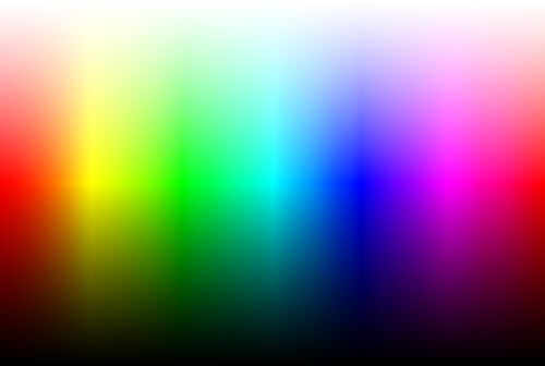
Brightness tells us how bright a color is, compared to the brightest, most saturated value of the color, and brightness goes from 0% to 100%. Anything with a brightness of 0% will be black, while 100% brightness gives us the most saturated bright color available. All the colors in the wheel above have 100% brightness.
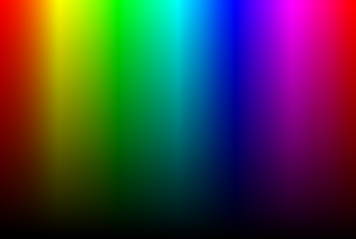
In this image, hue goes from 0 degrees on the left, to 360 degrees on the right. Brightness goes from 0% on the bottom, to 100% on the top. But note that HSB assigns 100% brightness in a way that isn't uniform; some colors are much brighter — visually — than others. 100% yellow is much brighter than 100% bright blue.
But note that brightness seems to act like a shade, where you mix a particular color of paint with black. The brightness value of 80% then is like a mixture of 80% color and 20% black, while 0% brightness uses 100% black paint.
Saturation tells us how pure or intense is a particular color. Saturation tells us how far a color is from neutral.
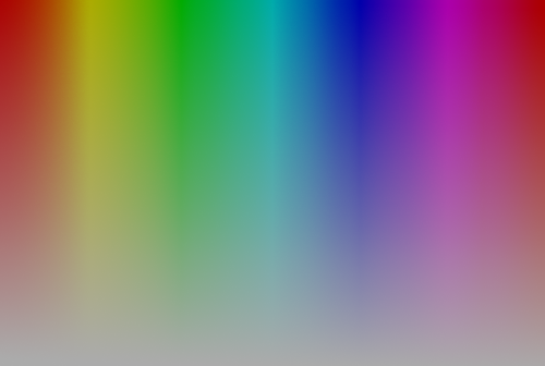
Hue goes from 0 degrees on the left, to 360 degrees on the right. Saturation goes from 0% on the bottom, to 100% on the top. As saturation goes to 0%, the colors go to the same pure gray color.
Saturation seems to act something like a tone and shade combined. First you mix together the pure color and white paint: for example, 40% saturation would mix 40% color paint with 60% white. Then you mix the resulting color with black in the amount specified by its brightness.
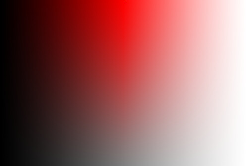
Here we mix together brightness and saturation with pure red:
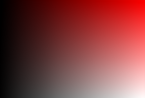
Brightness goes from 0% on the left to 100% on the right, while saturation goes from 0% on the bottom to 100% on top. Hue is fixed to zero degrees. This image shows the following characteristics:
- Pure red is in the upper right hand corner.
- Pure white is in the lower right hand corner.
- Pure grays are along the bottom.
- Pure shades of red are along the top.
- Pure tints of red are along the right hand side.
- Pure black is found along the entire left side.
The color selector square on the left of this shows us all possible hues with all saturations at a fixed brightness. The slider to its right can adjust for the brightness, keeping saturation and hue fixed.
The HSB system is useful because it works somewhat like an artist mixing bright primary colors with black and white. It also presents a natural ordering of color as is seen in the spectrum and color wheel.
Note that brightness, as defined by the HSB color system, is defined according to whatever color you happen to be using, and so 100% brightness gives us the pure color (whenever saturation is 100% also).
The HSB system is also called HSV, with V=Value.
An alternative system, HSL (Hue, Saturation, and Lightness) retains the H and S dimensions but substitutes Lightness that gives us white whenever it is 100%. For example, here is hue plotted against lightness:
Hue goes from 0 degrees on the left to 360 degrees on the right, while lightness goes from 0% on the bottom to 100% on the top. Pure saturated colors are found at 50% lightness. Adjusting lightness is like tinting a color when greater than 50%, and shading a color when less than 50%.
Plotting lightness versus saturation is this:
Lightness goes from 0% on the right to 100% on the left. Saturation goes from 0% on the bottom to 100% on the top. Shades and tints of red are along the top edge of the image, with pure red being in the middle of the top edge. Pure white is along the right hand side, pure black along the left edge, and tones of gray are along the bottom.
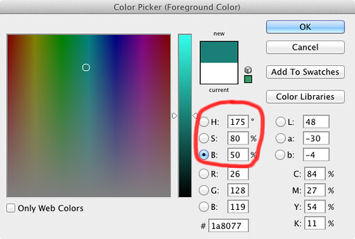
Photoshop allows us to select colors based on HSB, but we cannot edit images in that colorspace as we can when we convert an image to the Lab or CMYK colorspaces. But there is an optional component in Photoshop (available on the original disk) that we can install to get the HSB and HSL channels. From the Filters menu item we select Others and then HSB/HSL to get this dialog box:
Please note that after conversion, the image actually remains in the RGB colorspace. Since Photoshop really doesn't support HSB images, you have to remember what color space you converted to in order to go back.
The original image is on top, and the ‘converted’ image is on the bottom. Although you can edit your photos after the conversion, you can't see what the final result is like until you do the reverse conversion.
This simply changes the appearance of the color channels:
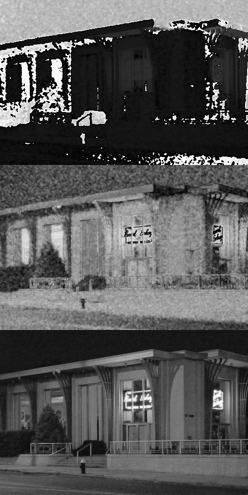
From top to bottom:
- Red channel = Hue
- Green = Saturation
- Blue = Brightness or Lightness
When I originally discovered this colorspace, I thought it could be very useful. For example, back in the days before Photoshop had a ‘Vibrance’ function, I wanted to selectively saturate an image so as not to overexpose or underexpose any of the color channels; this is something that the standard Saturation tool can do all too well. I thought that the saturation channel of HSB could be used as a mask.
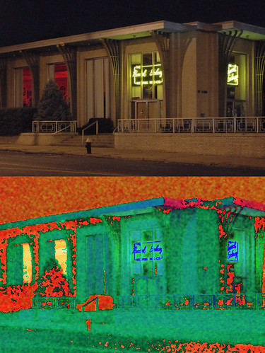
But black can have any saturation at all according to HSB. This is counter-intuitive. Just look at the sky in the photo: it is very dark, it ought to have low saturation, but the noisy saturation pattern shows us otherwise.
I had the bright idea that HSB could be useful for noise reduction. Blurring the color channels is a popular and accepted method for reducing chroma noise, so why can’t I do it in HSB?
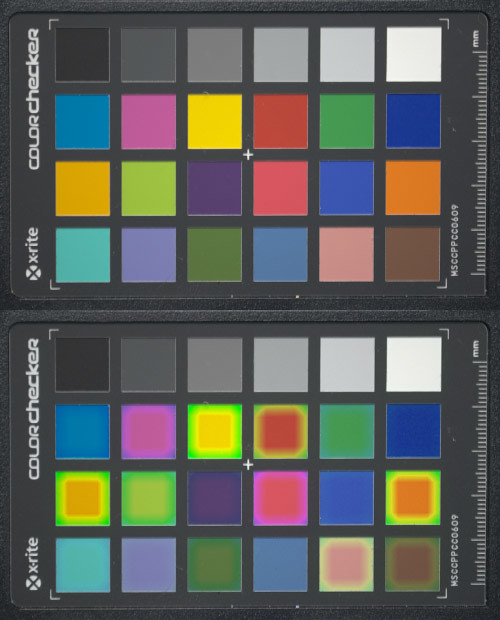
I just had to do this once to see that it was a big FAIL. I didn’t think about what I was doing. It is interesting to see that HSB thinks that the black color of the chart has a green hue, which is seen bleeding over the colors.
I’ve been unable to come up with any good use for the HSB channels. Whatever I wanted to do, there was a better way of doing it in another colorspace.
There are a number of other technical reasons why HSB and HSL are bad colorspaces:
- HSB and HSL are not absolute, but rather depend on what color space you are working in, like sRGB or Adobe RGB. An HSB number like 0° Hue, 100% Saturation, 100% Brightness does not name a concrete color, but rather the primary red color of whatever colorspace you are working in.
- Look at the images above which show hue. Note that the colors do not flow smoothly into each other, as we would like. Yellow, cyan, and magenta appear to be ‘spikes’, with same phenomena to a lesser degree happening to red, green, and blue. As it happens, the colors are distributed linearly between the primary and secondary colors, and do not flow in a more visually-uniform manner.
- Take a look at the image of hue versus saturation above. At 100% saturation, the areas of red, green and blue tones appear to be much broader than the secondary colors. But go down the image towards lower saturation: the secondary tones yellow, cyan, and magenta now appear to be much broader than the primary colors. It appears that saturation shifts colors. This color shift is also apparent in the hue versus lightness image. [Update: it appears that some of these artifacts are due to my monitor’s calibration.]
- Black can have any hue and any saturation. Attempts to edit an HSB image (as seen in the Colorchecker image above) can lead to strange artifacts whenever black is involved.
- Brightness and luminance do not describe the relative brightness of each color. Pure blue is considered to be just as bright as yellow, even though visually it appears to have a tenth of the absolute brightness.
- Saturation is problematic in HSL. A pale light yellow is said to have the same saturation as does a rich green color.
Cynthia Brewer of Pennsylvania State University wrote:
Computer science offers a few poorer cousins to these perceptual spaces that may also turn up in your software interface, such as HSV and HLS. They are easy mathematical transformations of RGB, and they seem to be perceptual systems because they make use of the hue-lightness/value-saturation terminology. But take a close look; don’t be fooled. Perceptual color dimensions are poorly scaled by the color specifications that are provided in these and some other systems. For example, saturation and lightness are confounded, so a saturation scale may also contain a wide range of lightnesses (for example, it may progress from white to green which is a combination of both lightness and saturation). Likewise, hue and lightness are confounded so, for example, a saturated yellow and saturated blue may be designated as the same ‘lightness’ but have wide differences in perceived lightness. These flaws make the systems difficult to use to control the look of a color scheme in a systematic manner. If much tweaking is required to achieve the desired effect, the system offers little benefit over grappling with raw specifications in RGB or CMY.RGB and CMYK are output-based color systems, which are closely related to actual, physical output devices such as computer monitors and printers. RGB also closely reflects how cameras capture color information. Editing in these color spaces, while not necessarily intuitive, is recommended so as to take full advantage of the output media. But as we have seen, there is very much value in using a more intuitive color model that reflects human vision. The Lab colorspace (fully supported by Photoshop) is particularly useful and is based on human vision.
HSB and HSL are problematic color spaces that do not live up to their promise. They were invented by computer scientists who needed a simple color system that worked well with the low-performance computer hardware available at that time. HSB (also called HSV) was invented by Alvy Ray Smith, who later co-founded the Pixar animation studio. HSL was invented by George H. Joblove (who subsequently did animation in the films Terminator 2, Spider-Man 3, the Chronicles of Narnia, and many others) and Donald Greenberg (who previously worked on the Gateway Arch; he subsequently won many awards in the computer graphics field, and has trained many of the prominent animators working today.) Both HSB and HSL were first published in the August 1978 volume of SIGGRAPH's Computer Graphics newsletter. As these men all had quite remarkable careers, we perhaps should not judge them so harshly because of their color system inventions.
The problems found in HSB and HSL are also found in more serious color standards. The Natural Color System (NCS), which is the official color system of Sweden, Norway and Spain, is based on the notions of blackness, saturation, and hue based on opponent colors, But it has the defect of assigning the same brightness to its base colors of red, green, yellow, and blue. Also, NCS had the flaw of assuming that red and green are opponent colors, which is not true. NCS is based on the philosophical theory of phenomenology — and not directly on human psychology — which may have led the designers to make some mistakes.
Three numbers suffice to describe color, and so we can build three-demensional color models. The RGB system forces all colors into a cube, while HSB and HSL force all colors into a cylinder. But as we see, these systems are not visually uniform and have plenty of problems.
Mathematics is good only insofar as it reflects reality. Bright, saturated yellow is brighter than bright, saturated blue. Magenta is the opponent color to green. Black and white have no hue and no saturation. A mathematical model of color ought to consider these facts and model them well. It appears that the best color model today is the Munsell color system, which arranges the colors in a visually uniform, but irregular solid. It does not force colors into a regular geometric solid such as a cube or cylinder. Albert Munsell was an artist and art teacher, and he wanted to be able to communicate color to his students in a more uniform and logical fashion than just using color names, and he began by organizing his colors by visual appearance. Originally, he thought that he could organize all the colors into a sphere, but eventually he found out that an irregular shape better reflected the visual ordering of the colors. Here is an example of slice taken through the Munsell color solid:
| 12 | 10 | 8 | 6 | 4 | 2 | 0 | 2 | 4 | 6 | 8 | 10 | 12 | |
| 10 |
255 255 255
| ||||||||||||
| 9 |
228 228 250
|
232 232 232
|
243 227 207
|
250 227 178
| |||||||||
| 8 |
190 201 239
|
200 200 222
|
203 203 203
|
215 200 181
|
221 200 154
|
227 200 126
|
233 199 97
|
237 199 63
| |||||
| 7 |
142 176 241
|
154 175 225
|
164 175 210
|
173 174 195
|
179 179 179
|
188 173 155
|
194 173 128
|
200 173 101
|
205 172 72
|
210 172 29
| |||
| 6 |
79 150 244
|
101 150 227
|
116 149 213
|
128 149 198
|
138 148 182
|
146 148 168
|
150 150 150
|
161 147 129
|
167 147 103
|
173 146 75
|
178 146 42
| ||
| 5 |
46 124 214
|
72 123 199
|
89 123 185
|
101 123 171
|
111 122 156
|
120 122 142
|
124 124 124
|
134 121 103
|
141 121 77
|
146 120 48
|
150 119 9
| ||
| 4 |
38 97 172
|
59 97 158
|
74 97 144
|
85 96 130
|
93 96 116
|
97 97 97
|
108 96 77
|
114 95 52
|
119 94 25
| ||||
| 3 |
26 72 133
|
45 72 120
|
58 72 106
|
67 72 92
|
70 70 70
|
81 71 55
|
87 70 33
| ||||||
| 2 |
20 49 93
|
35 49 79
|
44 49 66
|
48 48 48
|
57 48 34
|
63 47 6
| |||||||
| 1 | 5PB |
13 28 56
|
23 28 45
|
28 28 28
|
37 27 9
| 5Y | |||||||
| 0 |
0 0 0
| ||||||||||||
This is a visually-uniform system; and there ought to be a visually equal difference between adjoining color patches. (However, note that the presence of the gray background causes the appearance of some irregularity in this image.) Because the system is visually uniform, the outline of the colors are not uniform. Saturated blues will always be darker than saturated yellows, as is shown here.
In the Munsell system, there is no upper limit to the chroma, or the brightness and saturation of color. Bright new pigments or fluorescent dyes can be added to the outside edge of the Munsell solid as needed.
I started this article with a warning that the information contained here was problematic, error-prone, and obsolete. The HSB and HSL color systems, although supported somewhat in Photoshop, are problematic color systems at best.
There is still a need for an artistic, more natural system of color in our editing software; but unfortunately HSB is not the solution. The commercial product HVC Color Composer allows the user to select color based on the Munsell color system. What makes this system novel is that it will automatically limit colors based on color gamut and human vision; it is also visually uniform. Unfortunately, since it is neither available on OS X Lion or on Photoshop CS5, I cannot evaluate the product here.
The best free alternative is to use the Lab color space found in Photoshop. Since this system arranges colors into a cube, it still has a component of unreality. Using Lab, it is very easy to drive a color out of gamut or out of the bounds of human vision. I also suspect that Lab has a slight color shift for dark colors. But Lab is otherwise very useful and logical, and I use it quite often.
For more information on color spaces, see my articles:
Color Spaces, Part 1: RGB
An RGB Quiz
Color Spaces, Part 2: CMYK
Part Two of "Color Spaces, Part 2: CMYK”
A CMYK Quiz
Color Spaces, Part 4: Lab
No comments:
Post a Comment