The CMYK color system is used by commercial presses, as well as by inexpensive desktop printers. CMYK is not a very broad system of color, but it has the basics, and is suitable for most printing purposes. Using cyan, magenta, yellow, and black inks, these printers can output a smaller range of color than even the sRGB standard (used by most cameras, computers, and HDTV), which in turn only displays about 35% of all possible colors. But CMYK can print all the basic classes of colors, with a nice, continuous gradation between these colors.
I am convinced that a thorough knowledge of the color structure of images is needed for quality photography. At a bare minimum, a photographer ought to know about the three color channels delivered by the camera — red, green, and blue — and how the RGB channels work together to represent color. You should just be able to look at an image, and imagine with your mind's eye how each of the channels ought to look. And by looking at black and white representations of the channels, you ought to be able to estimate roughly what the various colors are in the image. Using the “by the numbers method”, you ought to be able to know if your colors are correct just by examining the RGB values — even if you are color blind. See my article, Color Spaces, Part 1: RGB for an introduction to this color system.
But it is nice having printed output, instead of just viewing pictures on a screen. If you are fortunate someone might be willing to pay you to print your photos in a book or magazine, or you may make prints for clients. If you want to do an excellent job with printing, better than typical, then having an understanding of the printer's color channel structure is also essential.
RGB output assumes three primary colors on a brightly lit screen — you illumine red, green, and blue lights which mix together to produce a broad range of colors, including black and white. The more light illuminating the screen, the brighter the picture. CMYK, on the other hand, places four colors of ink on a page, and the more ink on the page, the darker the image. Fortunately, once you know RGB, moving to CMYK is is quite similar. See my article, Color Spaces, Part 2: CMYK for details.
The key is the opponent color system. Some colors, when mixed, produce other colors, like green and red lights shining together will produce a yellowish light; or when you mix cyan and magenta inks together you get blue. However, when you mix opponent colors together, you get gray. The RGB and CMYK color systems use colors that are opponent to each other: red is the opposite of cyan, and so on, and so the red channel will look quite similar to the cyan channel, while green will look similar to magenta. The major difference is the black channel in CMYK, which will have much of the shadow detail (by the way, RGB has very little color information in the shadows, and CMYK beats it in that department).
Let's examine how colors mix in the CMYK system (see the RGB article for analogous images):
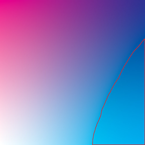
Here, we simulate an increasing amount of cyan ink moving across the image from none on the left to 100% coverage on the right. Likewise, we have an increasing amount of magenta ink from 0% at the bottom to 100% at the top. No yellow or black ink is shown. We have white at the lower left-hand corner, and somewhat purplish-blue at the upper right hand corner: if we draw a diagonal in between those corners, we have a purplish-blue color going from fully saturated, to a pastel, to white. Along the upper side of the image we a gradation between magenta, purple, and blue, and the right-hand side we have cyan merging into blue.
Please note that this is simulating ink on a page. The red outlined region, in CMYK, is actually outside of the color gamut of the sRGB color system used by this image. When I converted the image from CMYK to sRGB, Photoshop chose the closest sRGB color to represent what was found in CMYK. As it so happens, we can get better, brighter, more saturated cyan inks than what can be shown on most computer monitors: what you are seeing here is actually a bit duller than can be printed. (Perversely, if you were to print this image, some of these sRGB colors are themselves outside of the CMYK gamut, and the quality would degrade even further. Color management is complex, and frustrating.)
Most critical for photographers is the sky-blue colors along the middle of the right hand edge. These colors are outside of the gamut of sRGB — but are well within the range of CMYK. When skies are particularly deep in color, such found at high altitudes, or during a brilliant, clear winter day — especially when you use a polarizing filter — your sky will be out of the sRGB gamut, and will exhibit lots of noise (and this noise will be exaggerated by JPEG compression). Examine your red channel: if it is black, then you know the sky is out of gamut; but if you carefully process your photograph, starting with a RAW image and never entering sRGB, you still might be able to get a clean printed sky.
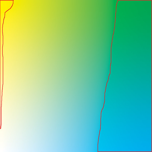
Here we have cyan ink going across, and yellow ink going upwards. There is no magenta or black ink. These two colors mix together to produce green. We have various colors of leaf-green going along the top edge, and ocean-green along the right edge.
Our outlined gamut warning areas show that we can get a bit better yellow on printed output than we can on a display. Recall that yellow is the opponent color to blue, and digital cameras do a very poor job of capturing blue colors, particularly at low light levels, which may translate to a somewhat poor yellow. But if you capture an exceptionally clean image in the blue channel, you can convert your RAW image to CMYK and use the high-quality ink to get a slightly wider range of yellow in your final image, especially good pastel yellows which are hard to come by in sRGB.
Far more problematic are the green colors: CKMY does a much better job with certain shades of green compared to sRGB. Again, this is a simulation, and were I to have printed the original CMYK file, the color differences would be rather striking. Especially problematic are most shades of ocean green, as well as some shades of leaf-green. This is an interesting observation: CMYK technology, which is quite venerable, does a better job with the natural colors of the sea, sky, and land compared to the computer standard sRGB color system. Also, flesh tones — especially for Scandinavians and Africans — can easily go out of the sRGB gamut. The computer standard was developed before digital photography became widespread — when computer graphics were more concerned with simple business and scientific diagrams — and so was not fine-tuned for common natural colors. However, sRGB does a better job with pure bright reds and blues.

Magenta going across, yellow going up. These mix together to produce red at the upper right hand corner. They don't mix to produce a really good, bright red as we see in sRGB. But we see that CYMK produces better yellows, and some oranges.

Cyan across, black up. Here we finally mix in some black tones, and clearly CMYK is the winner with cyans — and especially dark cyan colors. Recall that sRGB will often throw blue skies out of gamut, which the bright primary cyan ink and the black channel here makes up for quite nicely.

Magenta versus black. CMYK wins with dark magenta tones. Again, remember that you really can't see the actual effect of ink blending on your monitor — the real result is darker and richer.
Generally, RGB color models can be poor because they don't allocate much information to the shadows. There are very few variations of colors that are darker than the blue primary — only about 1% of all allocated colors, which can be seen in another article. Shadows in general tend to be poor, and the number of dark colors are severely limited. CMYK makes up for this by allocating much of its gamut to dark colors.
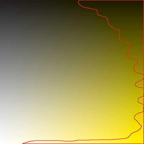
Yellow versus black. If you studied the previous charts, you probably guessed what this looks like.

Here I mixed 100% each of the three colors across the image, while I added black going up. You ought to notice on the lower half of the image that the mixture of the three colors is not precisely gray, rather it has a slight reddish tone, which tells us that the cyan ink is a bit deficient. (Cyan and red are opponent colors — more of one means less of the other.) With RGB, you merely make all three values equal if you want a pure gray tone, but with CMYK, cyan has to be a bit stronger. For this reason, doing a white balance in this color system is a bit more complex.
There are two reasons why printers have a black ink. One is that a CMY mixture is dark gray at best, and the other is the fact that too much ink on a page can cause smearing or other defects. The black ink can nearly replace all of the colored ink in the darkest shadows, using merely 1/3rd of the amount of total ink.
In the article Imaginary and Impossible Colors, I showed how three numbers are sufficient to describe any color visible to the human eye. CMYK uses four colors, which means there is often more than one way to specify the same color, by trading-off CMY for black. Printers consider the black plate to be the most important, and photographers creating CMYK separations of their photographs ought to study the trade-offs very carefully. You can also manipulate the K channel in Photoshop — it is an excellent place to add sharpening, local contrast, and nice steep curves for rich shadow detail, but you might inadvertently remove some color.
If you are sending your images to a desktop printer, do not use the CMYK color system. Rather, process your images in a wide-gamut RGB color space, such as Adobe RGB or ProPhoto, and set Photoshop's gamut warning to either CMYK or preferably the printer's own ICC profile. This will allow you to get the rich, deep colors, and to fully express the colors of nature, but avoid bright reds and greens which cannot be printed. Be aware that out-of-gamut colors will either translate to noise or to flat, muddy colors. Understanding CMYK will let you know what to expect. If your printer uses more than four colors, then you are quite fortunate as you can get richer, purer colors — install the printer's ICC color profile in Photoshop and process your images using that profile as your gamut warning. Be sure to use a wider-gamut RGB colorspace for your processing. Since you will be working with colors which likely can't be displayed on your computer monitor, you ought to take the leap of faith that your images might actually look better when printed than what you see on the screen — just keep a close eye on the numbers and on the gamut warning.
If you are sending your images to commercial press, you will want to study CMYK further, or just take your chances and let the pre-press folks do the conversion for you.
You don't have to convert your image to CMYK in order to see what amounts of inks your image would use. You can configure Photoshop's Info panel to display CMYK values for the eyedropper tool. If you are attempting to set a particular color to the brightest possible CMYK red value, you can set an eyedropper on the color and keep an eye on the CMYK values as you adjust your image: you want to set magenta and yellow near 100% with cyan and black low.
CMYK values are also used to correct an image for good skin color. Humans of all races have a cyan channel that is less than the magenta channel, and a magenta that is less than yellow. Black can be nearly any value depending on race. Be very careful not to adjust skin tones so much that they go out of gamut — that is particularly noticeable.
Read part one of this article on CMYK: Color Spaces, Part 2: CMYK
And here is my article on RGB: Color Spaces, Part 1: RGB
If you are confident that you understand CMYK, try this: A CMYK Quiz
For color spaces based more closely on human vision, see this: Color Spaces, Part 3: HSB and HSL, and Color Spaces, Part 4: Lab.
No comments:
Post a Comment